Tesco - Grocery App
While the app is functional, I noticed areas where it could be more intuitive, visually engaging, and better suited to the modern shopper — whether it’s a student ordering on a budget or a busy parent managing the household. This redesign was driven not just by my own experience, but also through user research with real Tesco customers including friends, family, and people across different age groups.
My goal was to re-imagine the Tesco app with a stronger focus on ease, clarity, and personalisation — helping users quickly find what they need, track spending, and enjoy a smoother, smarter shopping experience.
01
User Personas
User personas are essential for creating user-centered designs and enhancing product usability. Below are three personas who would use the app from different age groups and backgrounds. This allowed me to identify their pain points and also the requirements they would personally would need for the app.


02
Summary of User Personas
Susan Mike (Teenager, 18 years old):
A First-year university student who’s learning to manage life on her own. Between lectures and part-time work, she doesn’t have time for long shopping trips. She uses the Tesco app to save money, discover deals, and order groceries with flexible delivery slots. Susan values a fast, easy-to-navigate experience that makes reordering simple and helps her stick to a student budget.
Malik Johnson (Young Adult, 31 years old):
Malik leads a dynamic, on-the-go lifestyle and uses the Tesco app to maintain his health-focused diet while keeping up with work demands. With limited time to spare, he values a clean, responsive interface that allows quick filtering for dietary needs, seamless substitutions, and real-time delivery tracking. For Malik, the app is a tool for staying organised and in control of his grocery routine.
Aaliyah Ahmed (Middle-aged, 45 years old):
Aaliyah is a busy working mum who juggles her job and managing a household. She relies on the Tesco app to handle her weekly family shop, keep track of spending, and make sure nothing essential is forgotten. Aaliyah needs a reliable, structured experience with features like saved lists, Clubcard offers, and smooth delivery—so she can shop efficiently without added stress.
03
Problem Statements
The homepage lacks a clear visual hierarchy and user direction. This results in confusion, hesitation, and a lack of engagement.
Users don’t know where to focus or what action to take first, which disrupts the shopping journey.
04
Current app audit
The homepage lacks a clear visual hierarchy and user direction. This results in confusion, hesitation, and a lack of engagement.
Users don’t know where to focus or what action to take first, which disrupts the shopping journey.

05
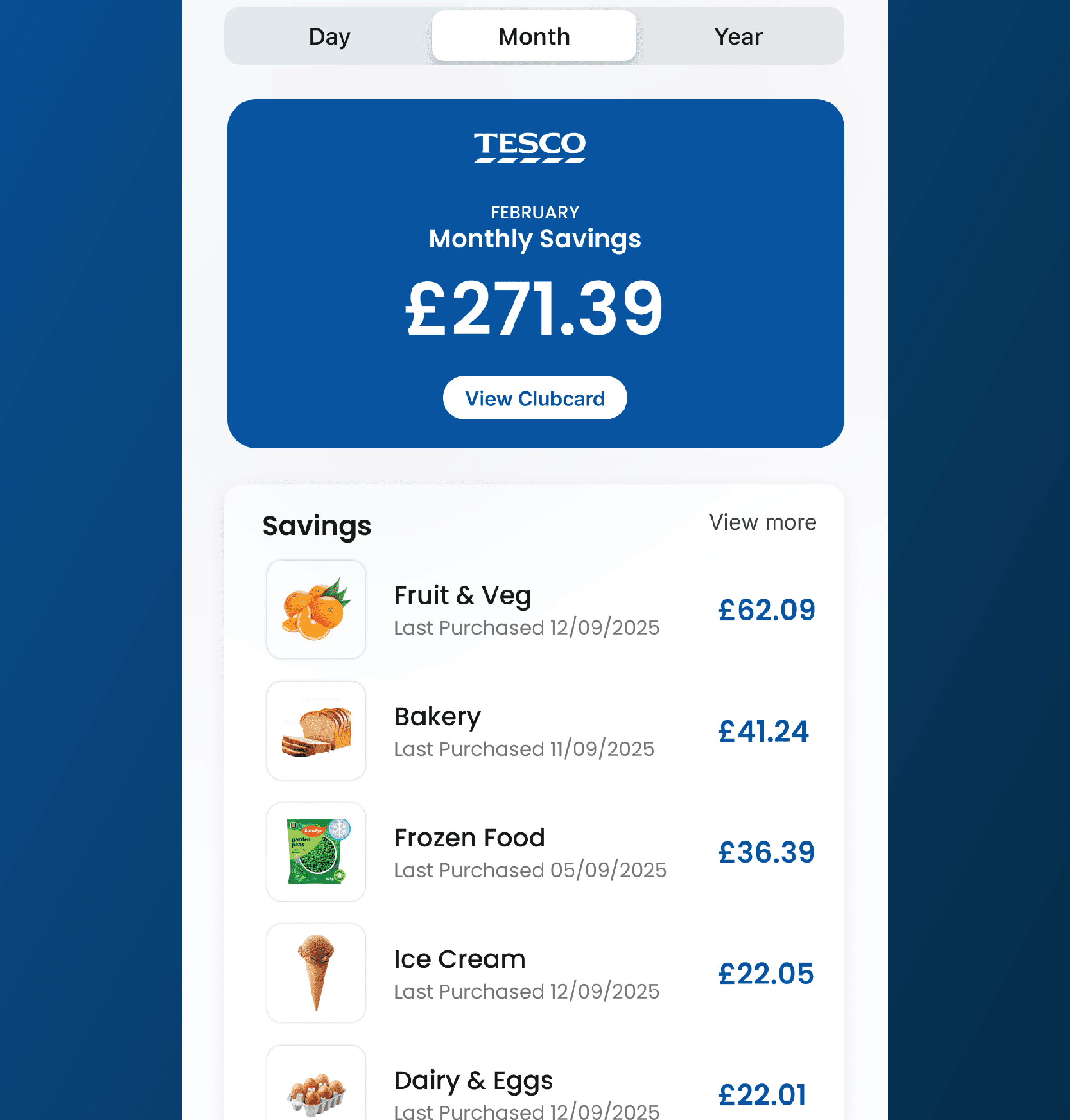
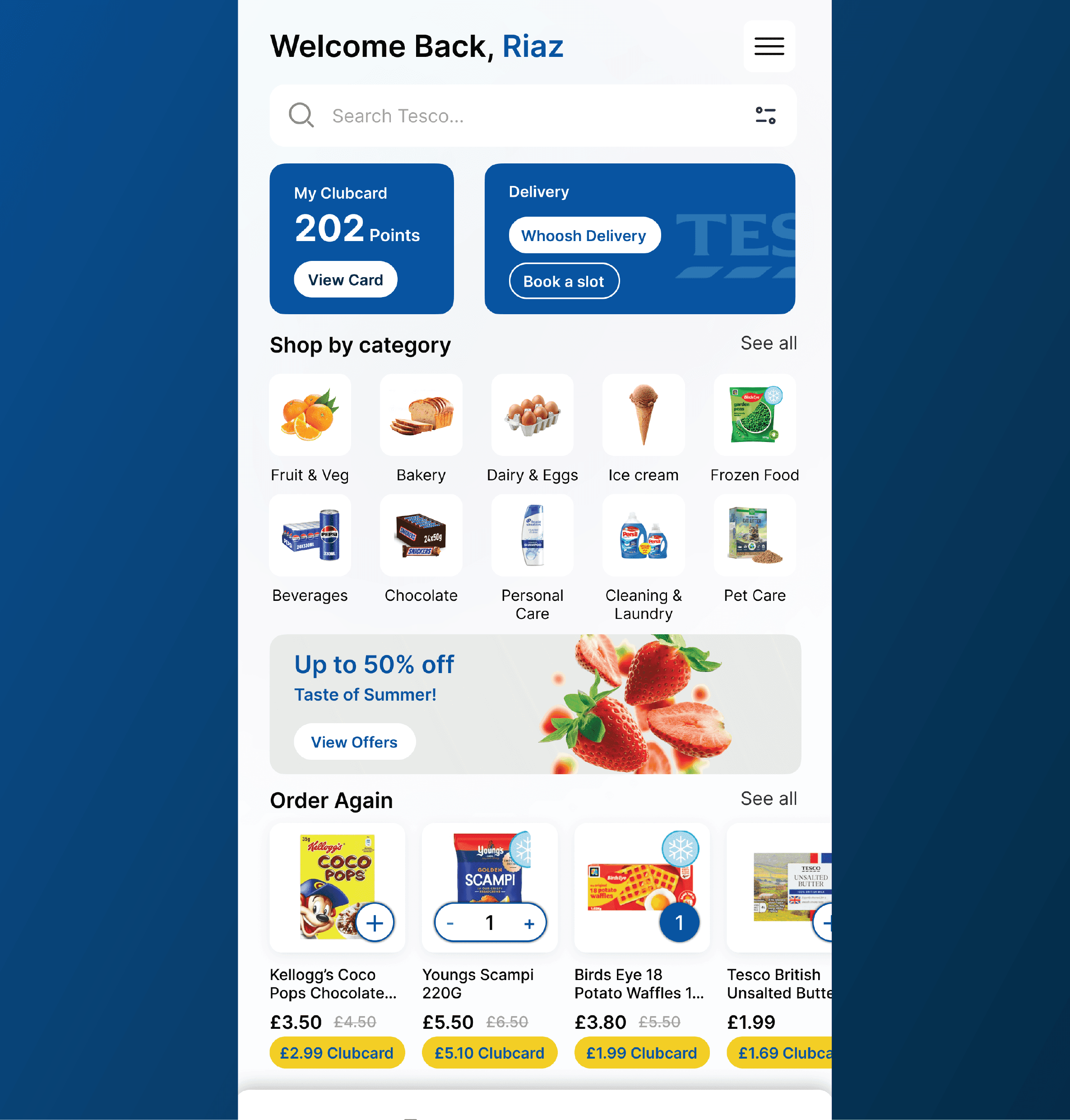
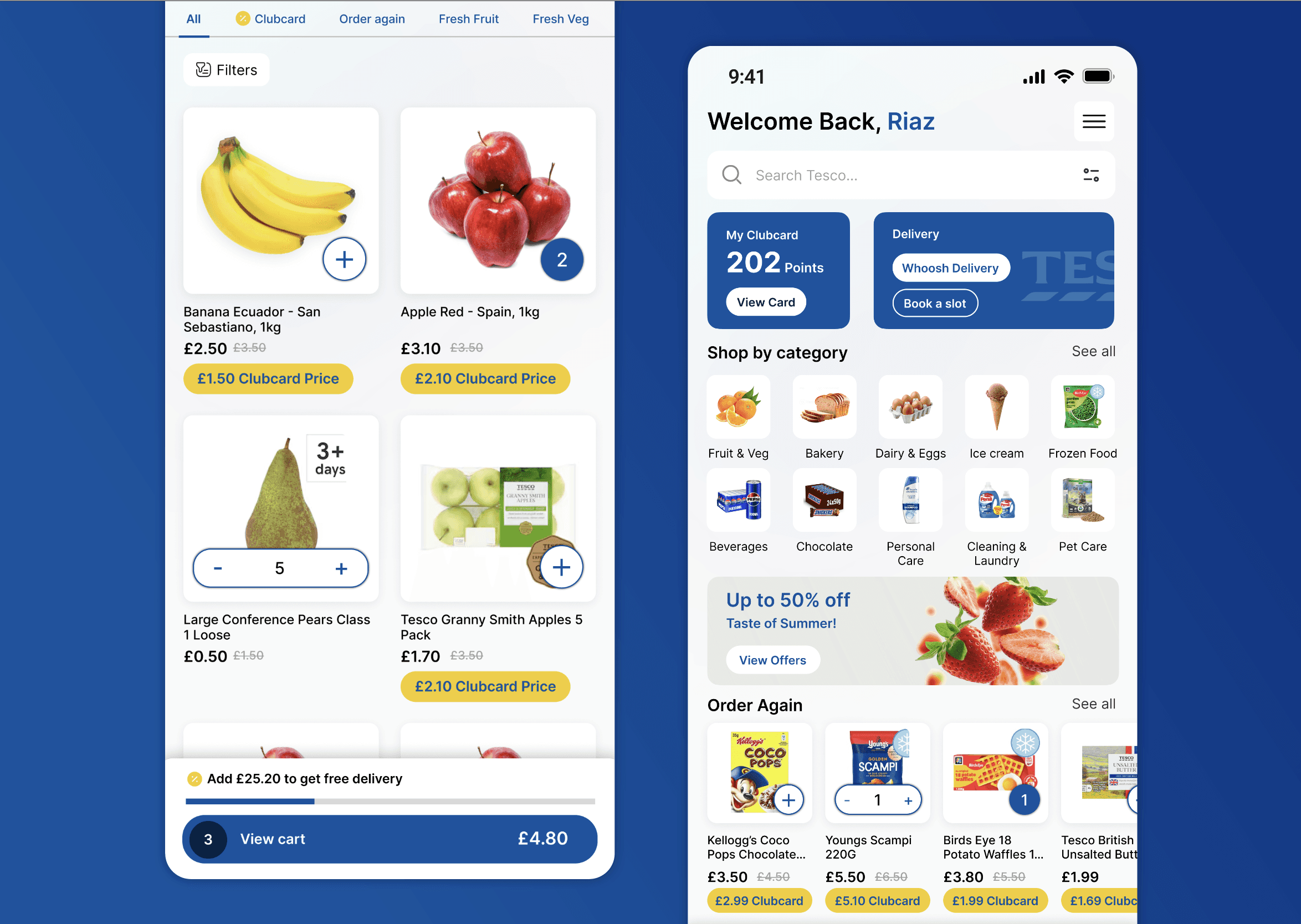
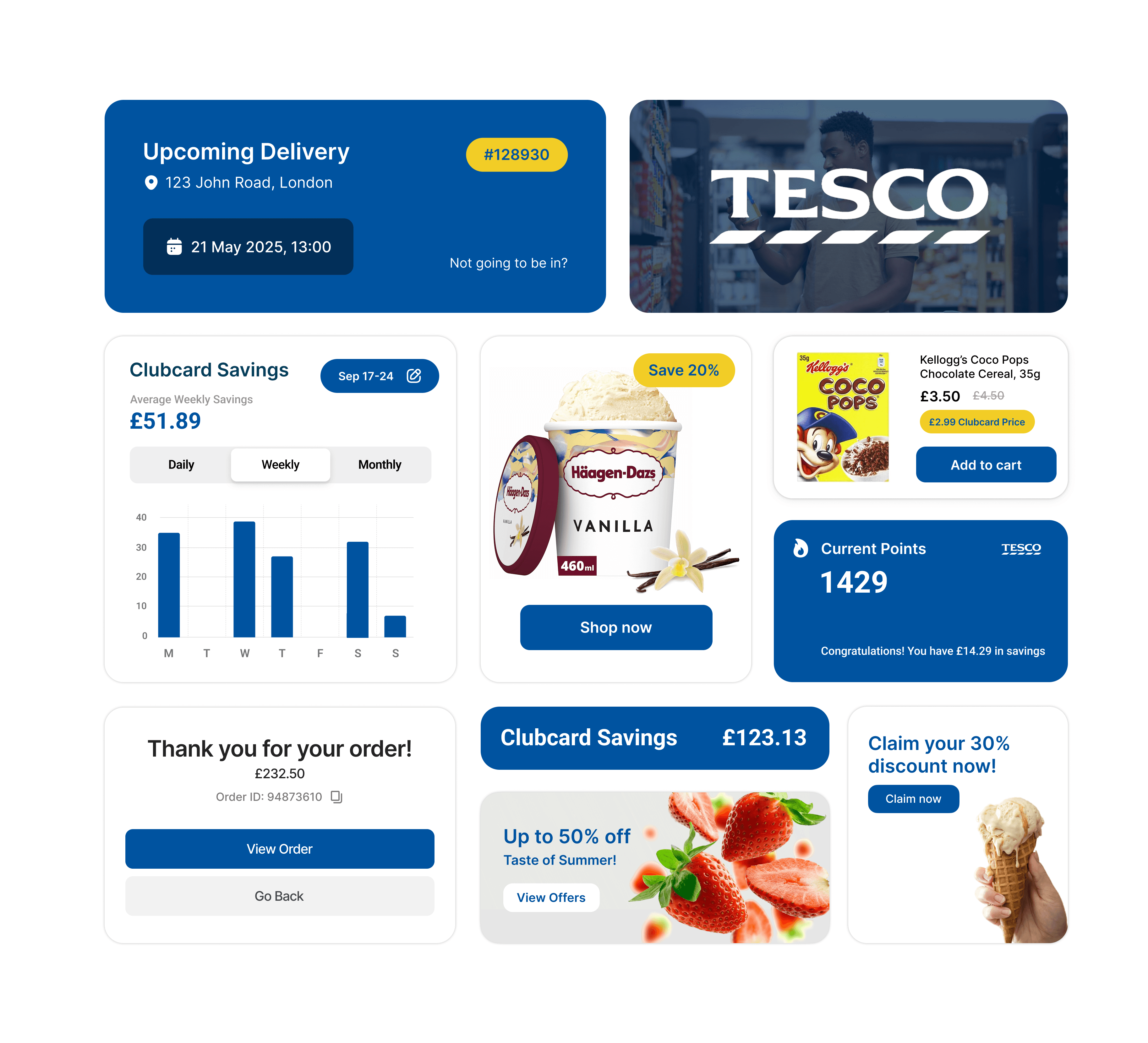
Solution
Redesigned the app’s functionalities to resolve user pain points and enhance user flows.
Introduce a strong visual hierarchy and primary CTA
Structure the layout with a dominant focal point, such as club card, organised content sections that guide the user step by step.
This improves user orientation, speeds up decision-making, and boosts engagement from the first screen.
Better user flow and journey so users can go from point A to B at the quickest time possible.

06
Component Library
To maintain visual consistency and improve usability across the app, I designed a set of modular UI components tailored for Tesco’s brand. These include buttons, navigation tabs, product cards, category tiles, and interactive filters—all optimised for responsiveness and accessibility. The components were created with scalability in mind, ensuring a cohesive user experience throughout the app.
07
Result
The final design delivers a cleaner, more focused shopping experience—reducing visual clutter, improving navigation, and enhancing product discovery. By addressing key usability issues, the redesigned interface supports a smoother user journey and better reflects Tesco’s commitment to convenience and accessibility.